Dissertation
Samuel and Stephen's Works
Subsequence is an experimental media project that discovers and disseminates topics related to crafts and culture from around the world through an alternative perspective.
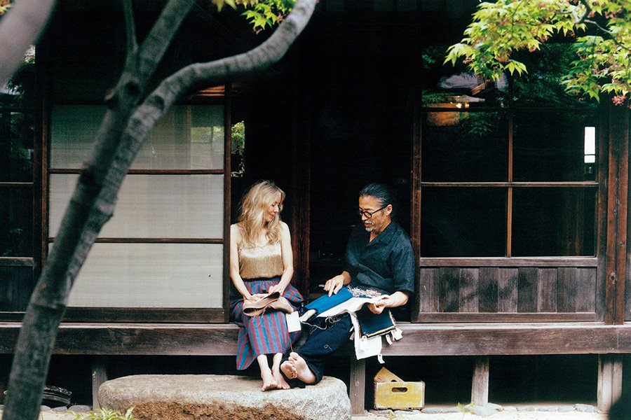
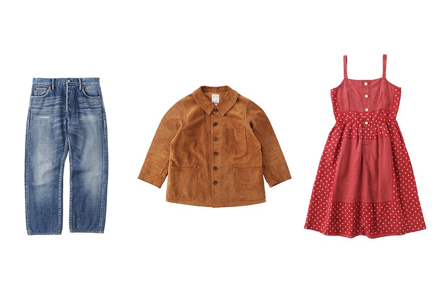
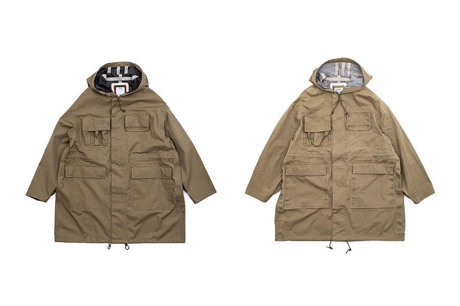
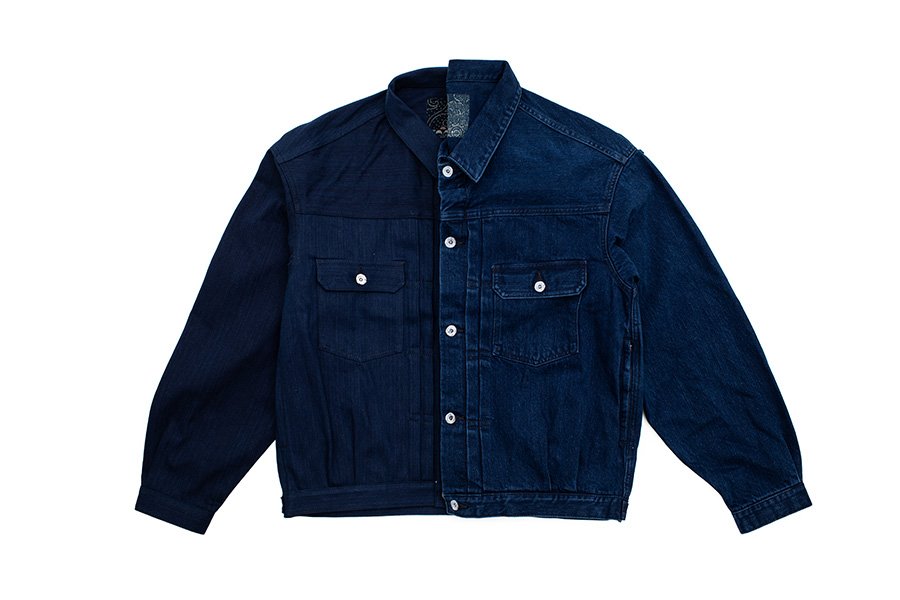
The work of London based photographer, Samuel Bradley and stylist Stephen Mann has been featured since the inaugural issue as a visvim WMV fashion editorial within the pages of the magazine, which acts as the primary medium for presenting content. For each feature, the only direction given from the editorial team is that the piece aligns with the magazine's theme for that edition. The repeat editorial feature overflows with the creativity of the pair and is simply a beautifully crafted story. We always prefer to have readers enjoy our content by viewing the impactful work in our large format print publication, however we have opted to introduce some of the content here for viewing.
| Category: | Products |
|---|
| Date: | 2024.10.08 |
|---|
| Tags: | #samuelandstephensworks #subsequence #visvim #wmv |
|---|
An interview that was conducted for a photo exhibition held in September 2024 at "VISVIM GENERAL STORE/VISVIM GALLERY" in Tokyo's Naka Meguro neighborhood to commemorate the launch of Subsequence Magazine vol. 7.
Samuel:
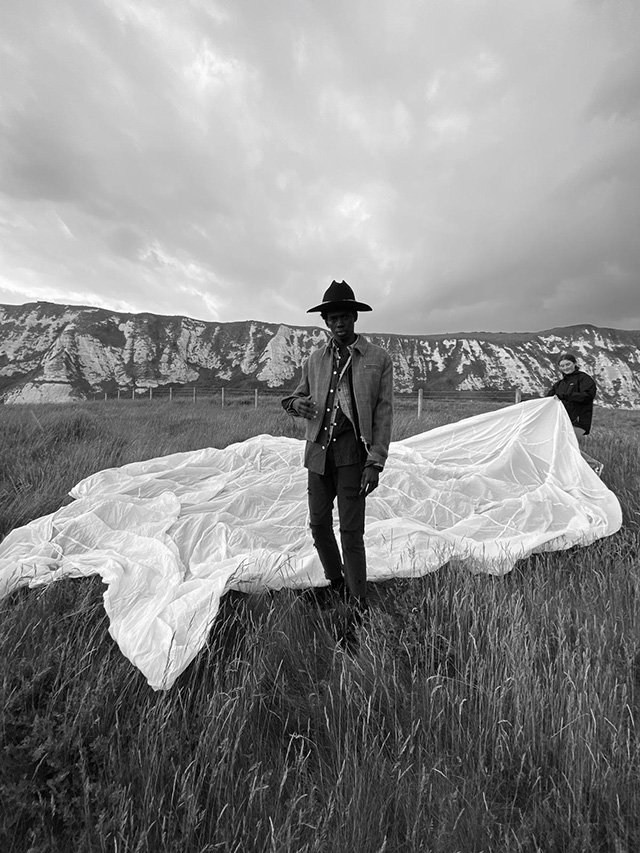
I come from a fine art and documentary background, my work is heavily influenced by Richard Avedon, Shōji Ueda, Dorothea Lange etc. And this has bled into my work for brands and magazines. However, often when shooting contemporary runway looks for fashion titles, I find my ideas compromised by the clothing. Visvim garments are crafted in such a way that they look worn, more akin to vintage than the typical new samples supplied by major houses. This allows for a rare kind of 'fashion picture' where the clothing does not interfere with the image but rather becomes a part of it. There's a more prevalent sense of reality. I keep coming back to shoot for Subsequence because of Visvim's clothing, because I know it's a key ingredient to timeless imagery.
Stephen:
Subsequence for me is not commercial work, there is time to enjoy the creative process and a freedom to create. Like all good things it has a sense of timelessness so it is as enjoyable today as it will be in the future. It has been an enjoyable partnership to collaborate with people I have known for many years and work with product of great craft.
In recent times online platforms have become the primary source of media and the overall market for print media has shrunk, which has in turn decreased the amount of work being done specifically for print. As this seems to be the current situation it is a very rare exception.
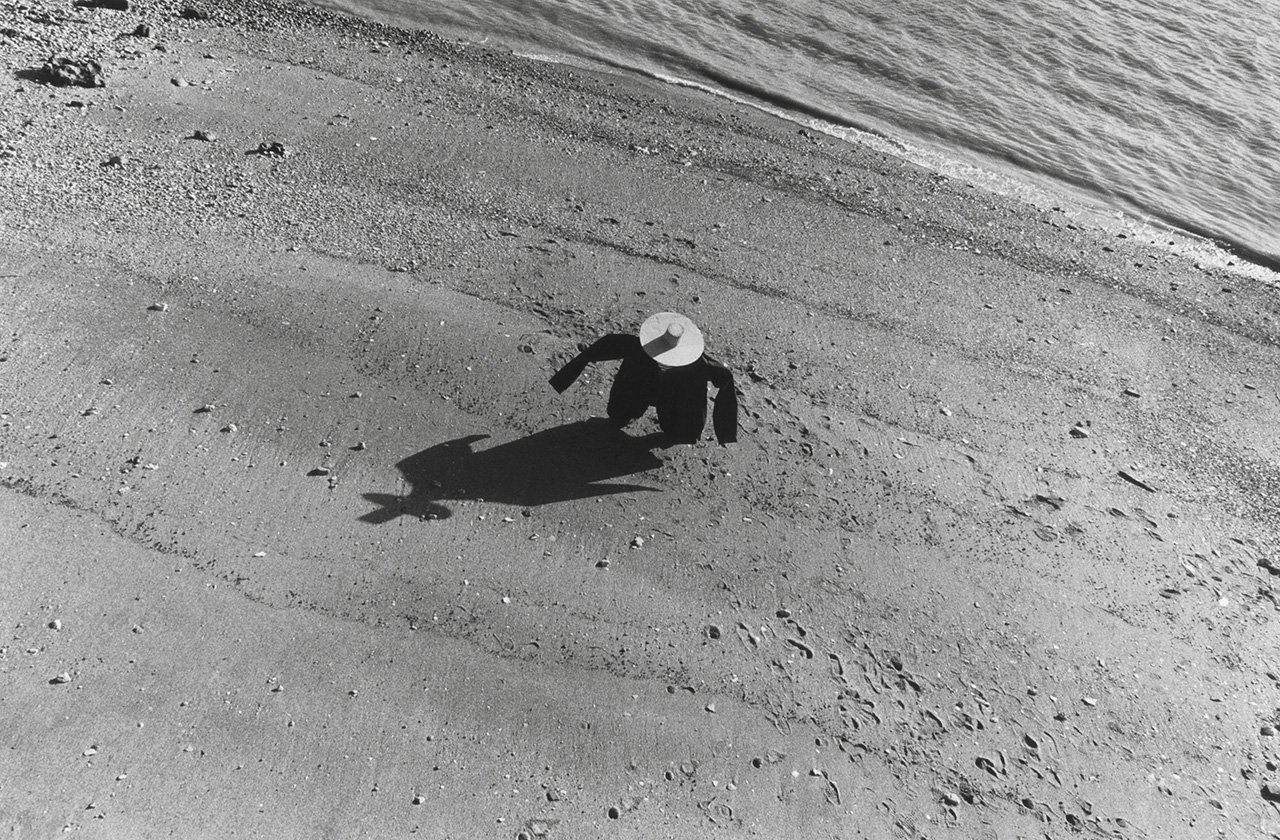
Samuel's notes regarding previously published editorial features.
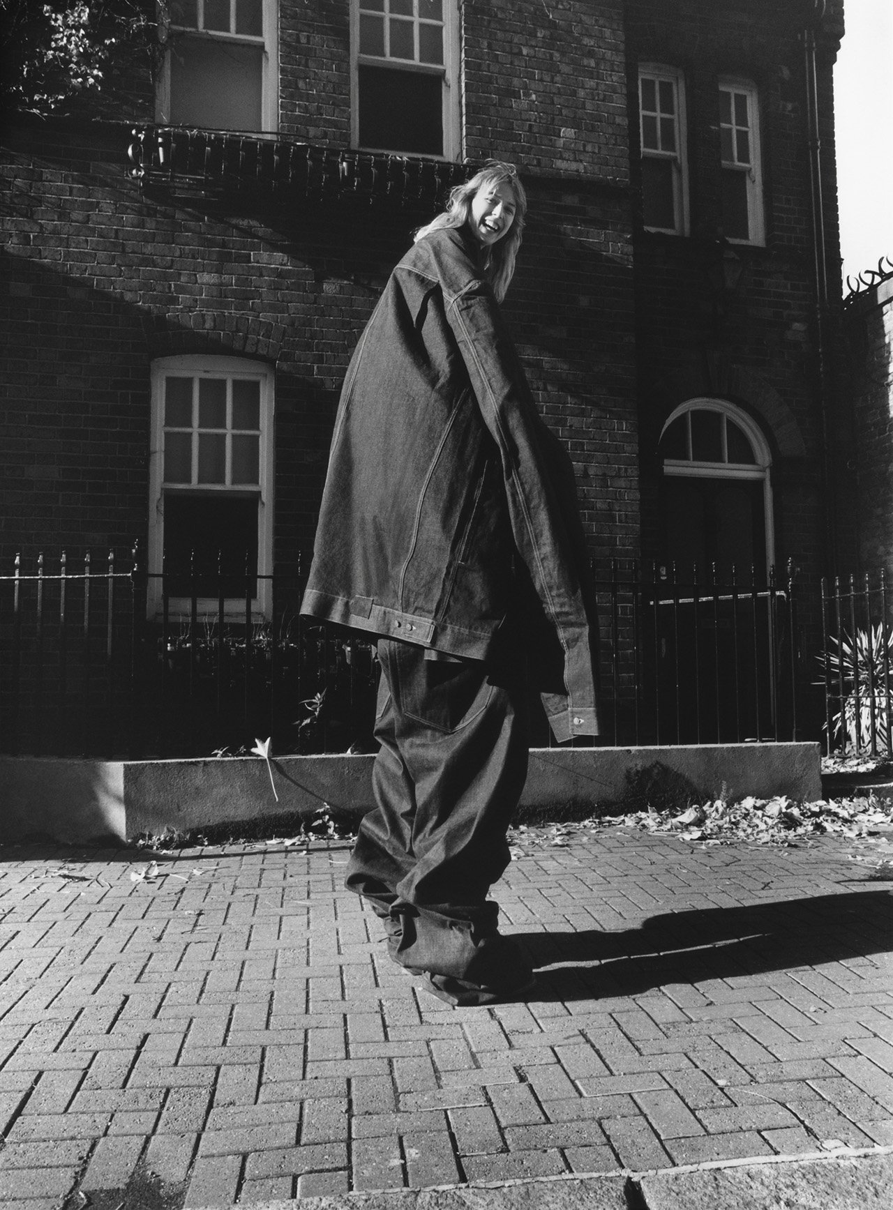
"Cast a Giant Shadow" published in Subsequence vol.1(2019)
Mine and Stephen's maiden collaboration with the magazine. I believe we had just worked on a Visvim special for Brutus Magazine, my first experience capturing the clothes. We had access to these giant archival denim pieces (which I always assumed were inspired by the pairs that Lee Jeans sent out in the 50's for in-store advertising) and wanted to focus on creating an oversized silhouette. This led us to the title 'Cast A Giant Shadow', a reference to the biography of Sandy Allen - the tallest woman in the world.
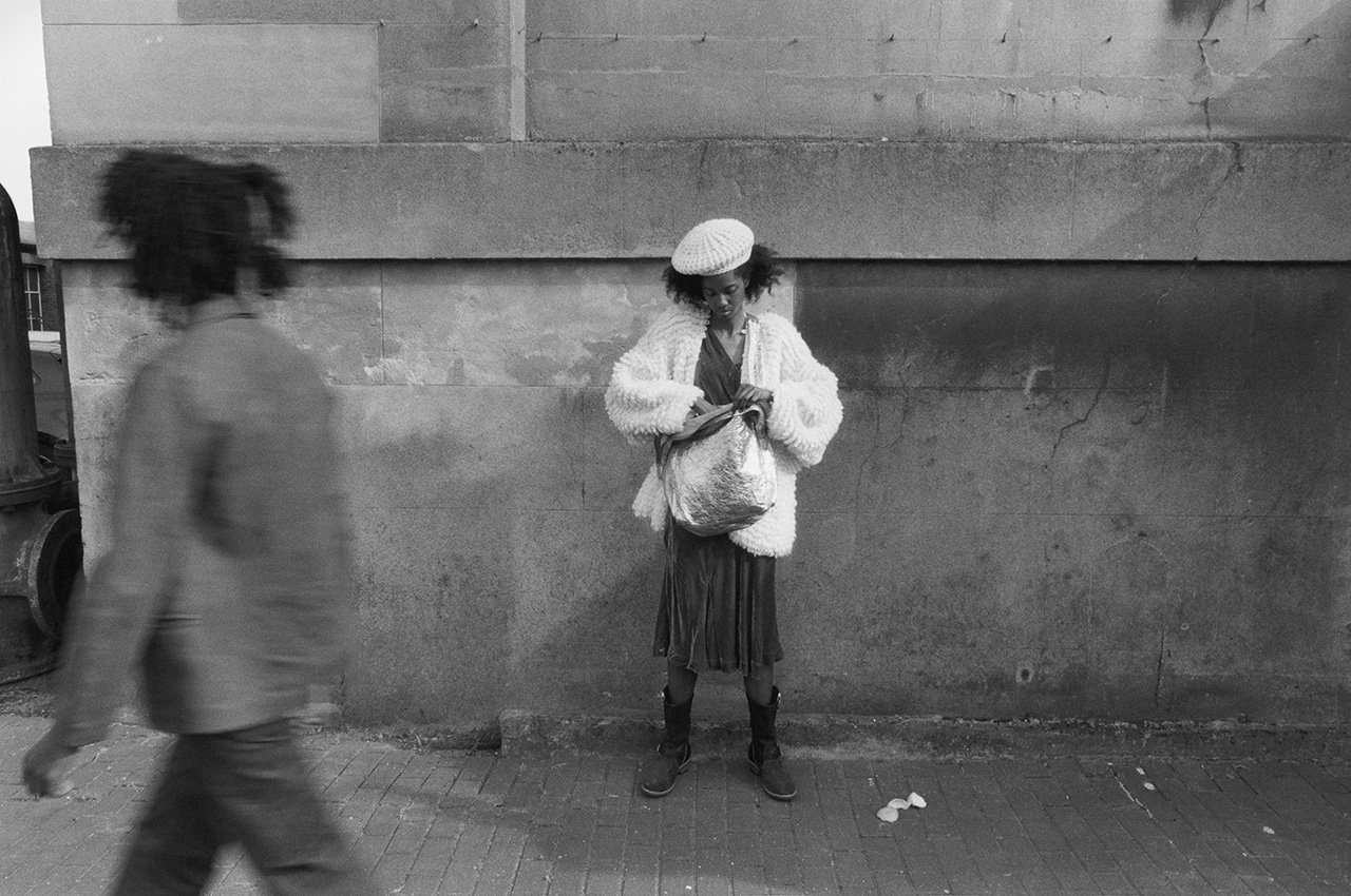
"House of Joy" published in Subsequence vol.2(2019)
Stephen was interested in sound system culture as the starting point for the styling. My references came from Gordon Parks' collaboration with Ralph Ellison for Time Magazine in 1952. Inspired by Ellison's book 'The Invisible Man', Parks created a series of photographs illustrating many of the novel's key scenes in Harlem. There's this compelling black protagonist presented in a series of images that have an undertone of documentary to them but are ultimately fantastical. I wanted my pictures in this story to have that same feel, documentary with a sense of unreality.
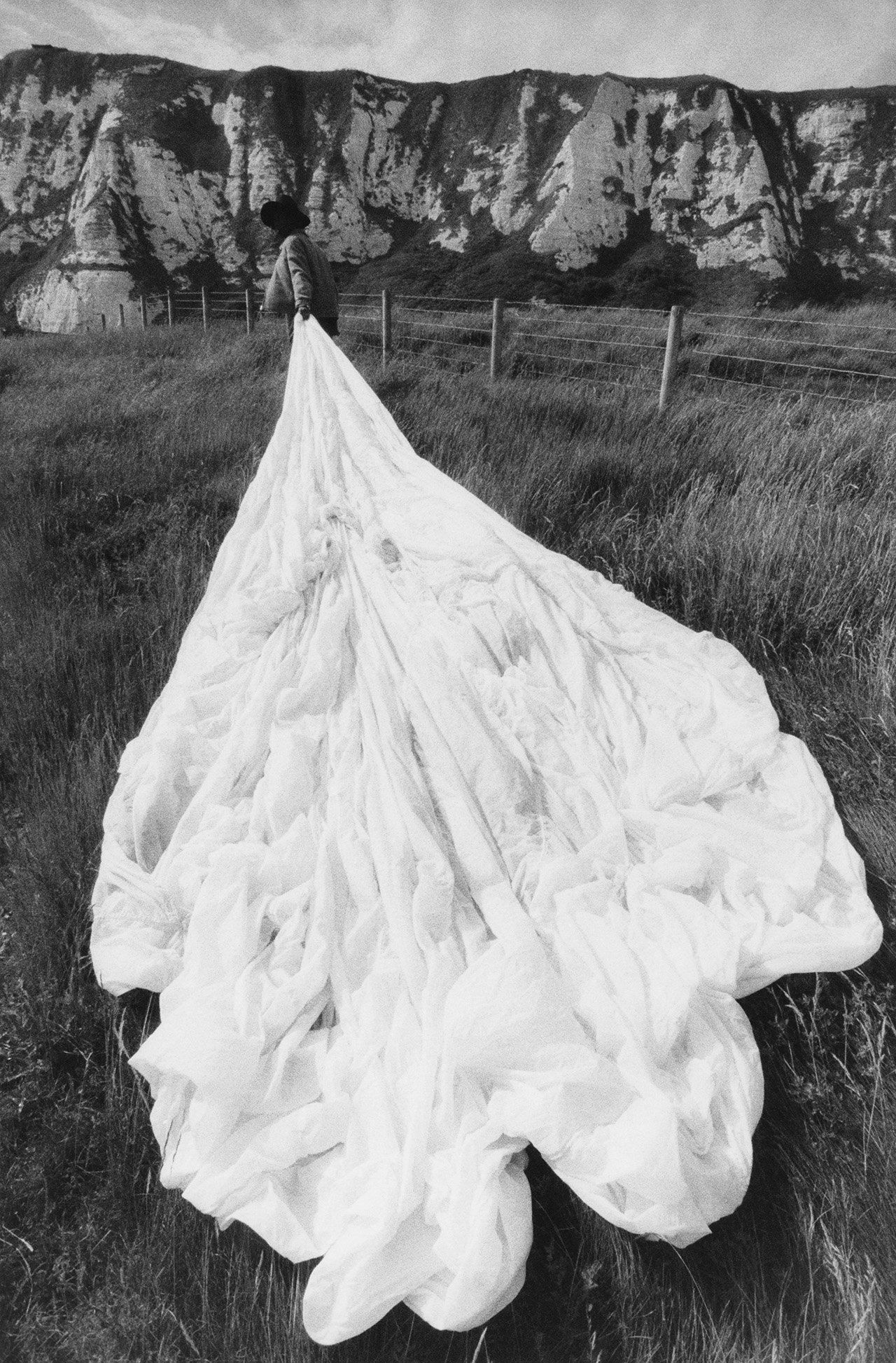
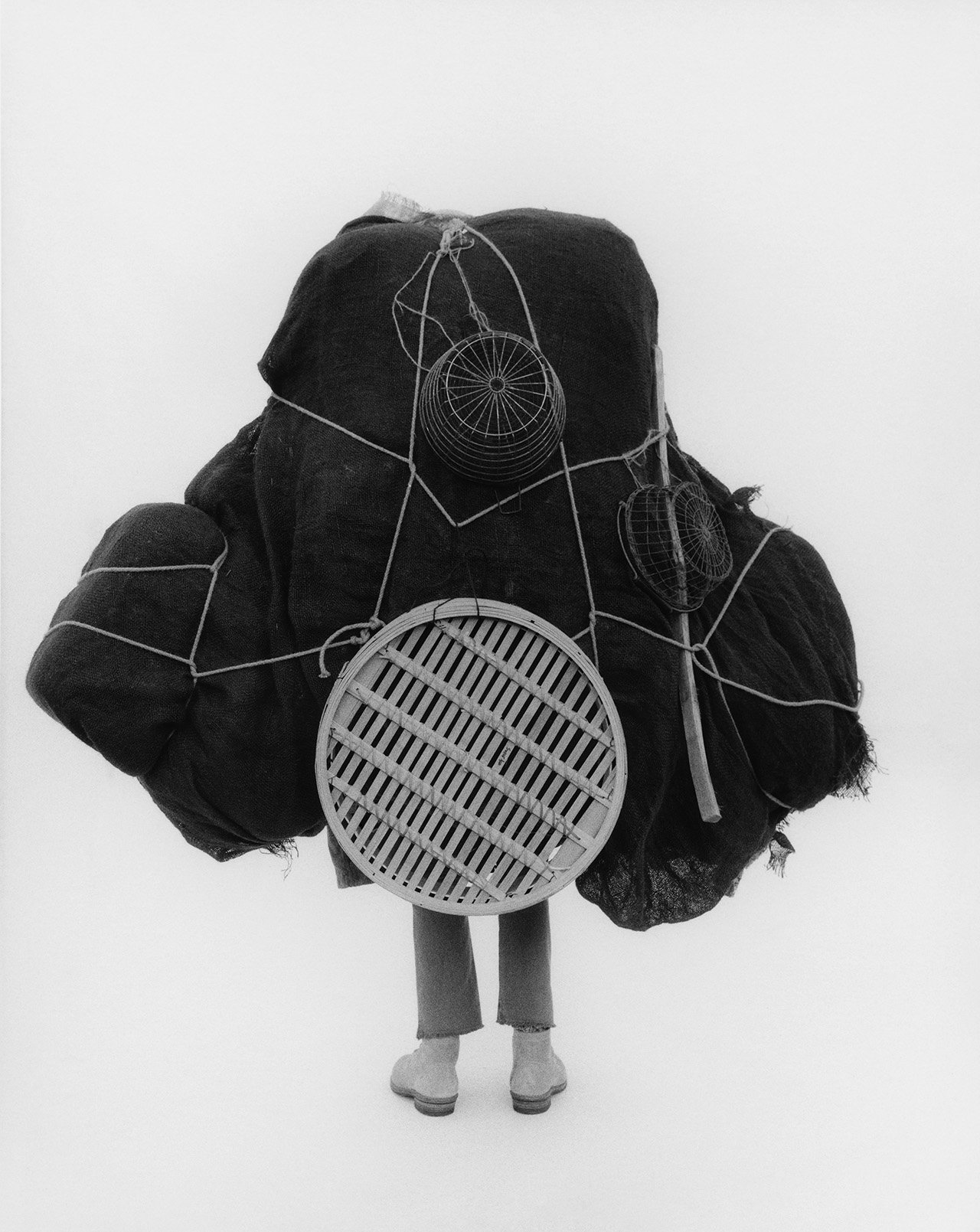
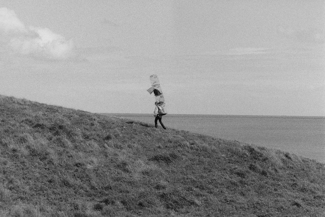
"Difficult Beyond Here" published in Subsequence vol.3(2020)
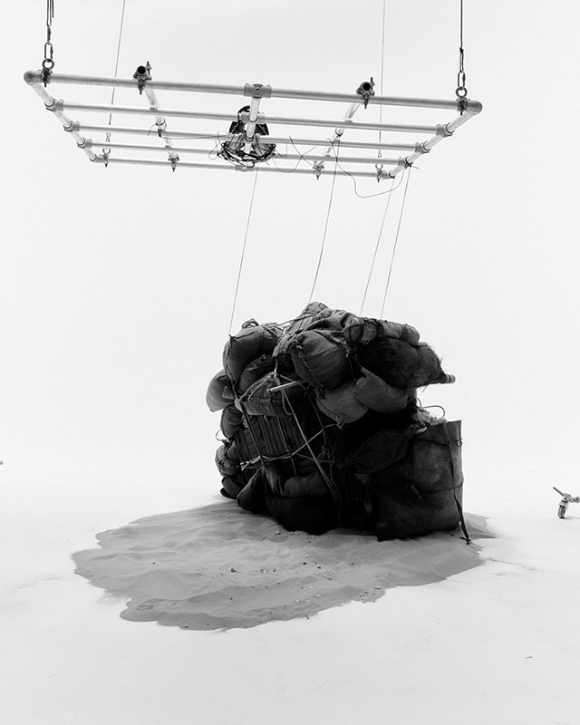
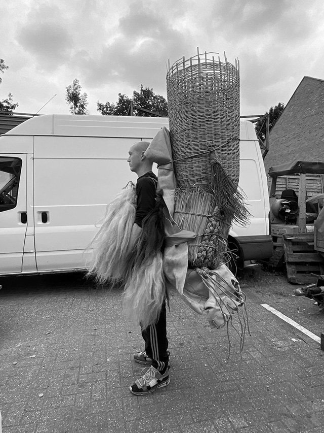
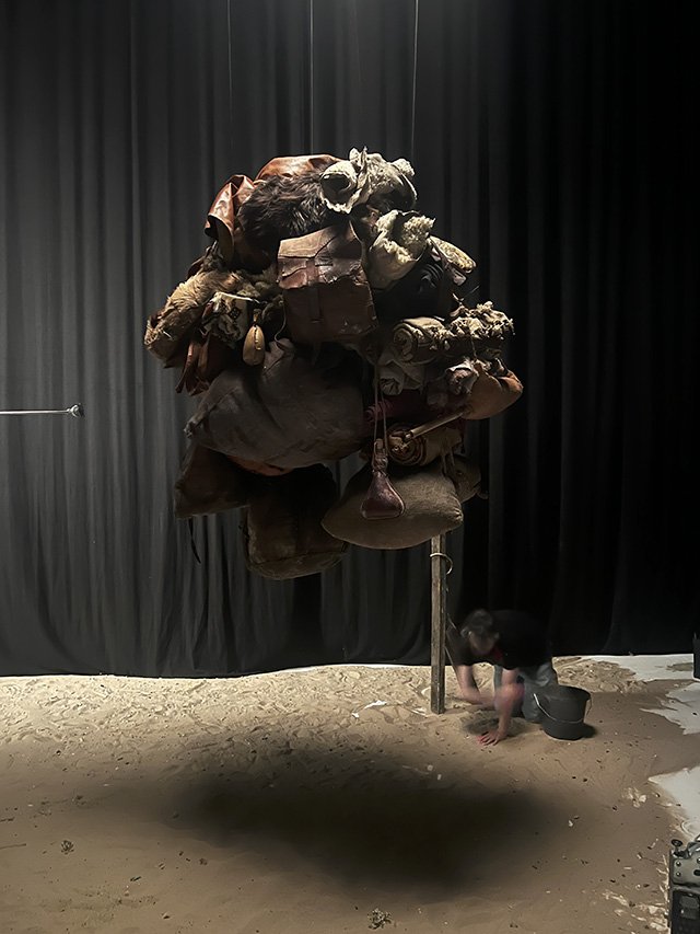
I think this was a creative turning point for my approach to shooting for the magazine. Whereas before I had treated the shoots as smaller photo essays, with the clothing as the starting point, this time Stephen and I started with a more theatrical creative concept. In this case, giant rucksacks inspired by photographs of sherpas carrying heavy loads up mountains. We expanded the team, bringing on a set designer to help us realize the idea. This may be my favorite story for the magazine to date. I felt so at home with the concept and execution. The pictures were incredibly influential for my practice moving forward.
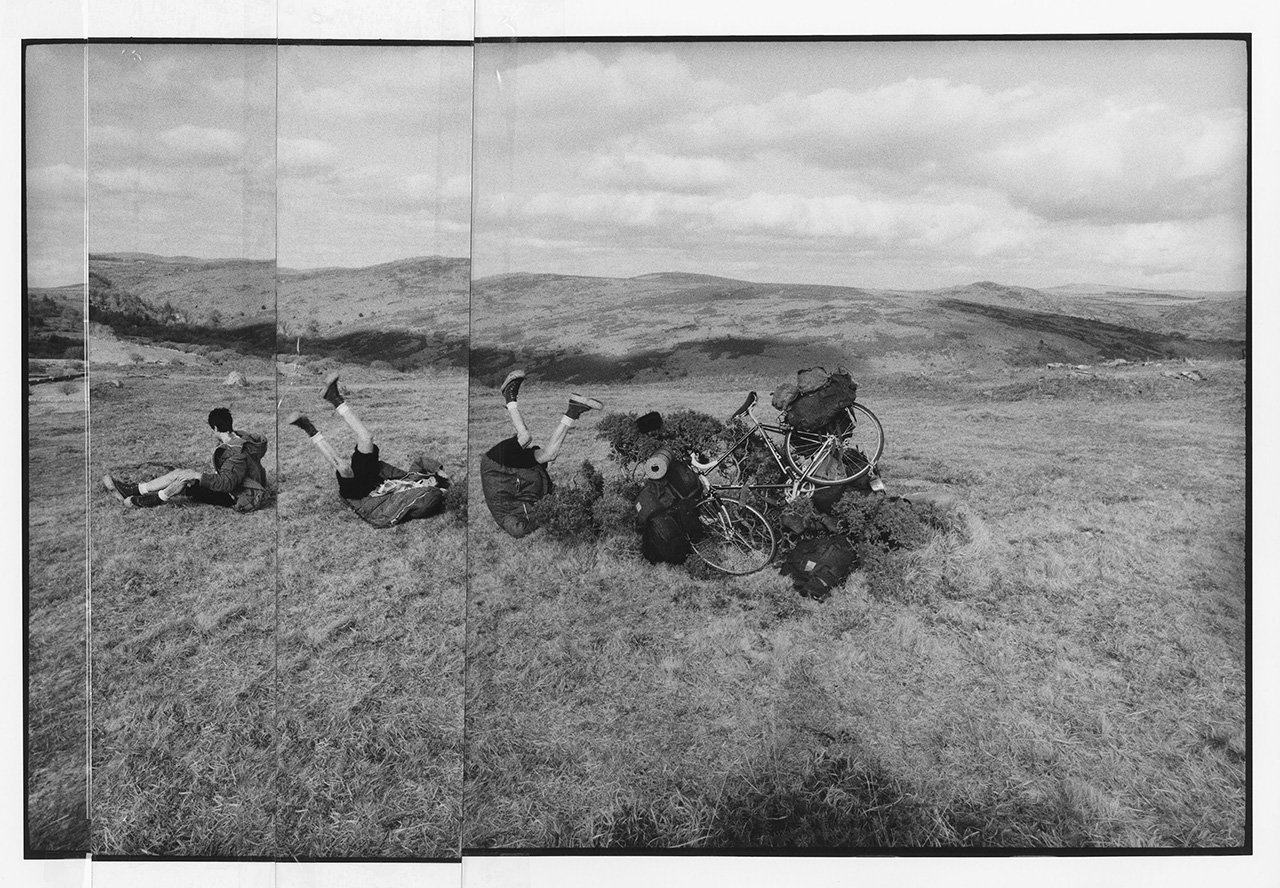
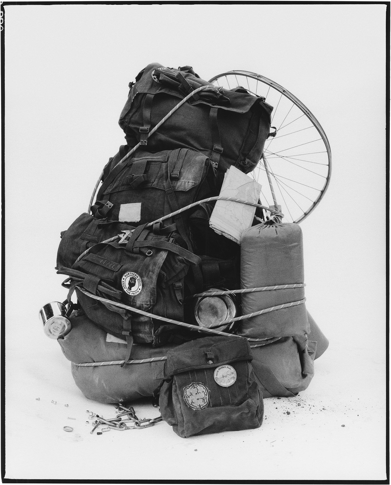
"This is the Life" Published in Subsequence vol.4(2021)
This one has a pretty evident cycling theme. Stephen showed me a book about 'The Rough Stuff Fellowship archive', a fringe off-road cycling club started in 1955. Coincidentally I'd been reading about people cycling to Everest Base Camp and the book was in the same vein, the pages featuring people completing epic cross country, all-terrain journeys on what most contemporary cyclists would identify as road bikes. Totally bonkers but equally inspiring.
I really wanted to introduce more narrative into this story and I had spent a lot of time during Covid experimenting with image and text. I wrote a very simple story to accompany the images and then cut out choice lines to stick onto the hand prints I made in the darkroom, before scanning them in. I also made custom stickers on a label maker referencing place names from the location and surrounding towns.
I should note we shot the story on Dartmoor, a beautiful national park in the southwest of England near where I grew up. We spent two days building and photographing the bikes within the landscape. It ended up feeling quite personal to me, being at those locations as I'd spent so much time there as a child. My mum even stopped by for a cup of tea on set and met the team.
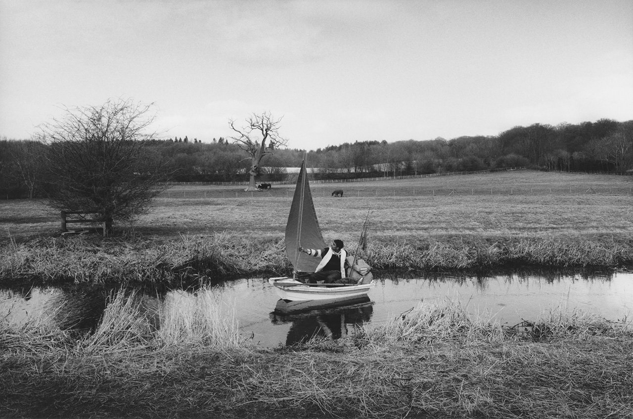
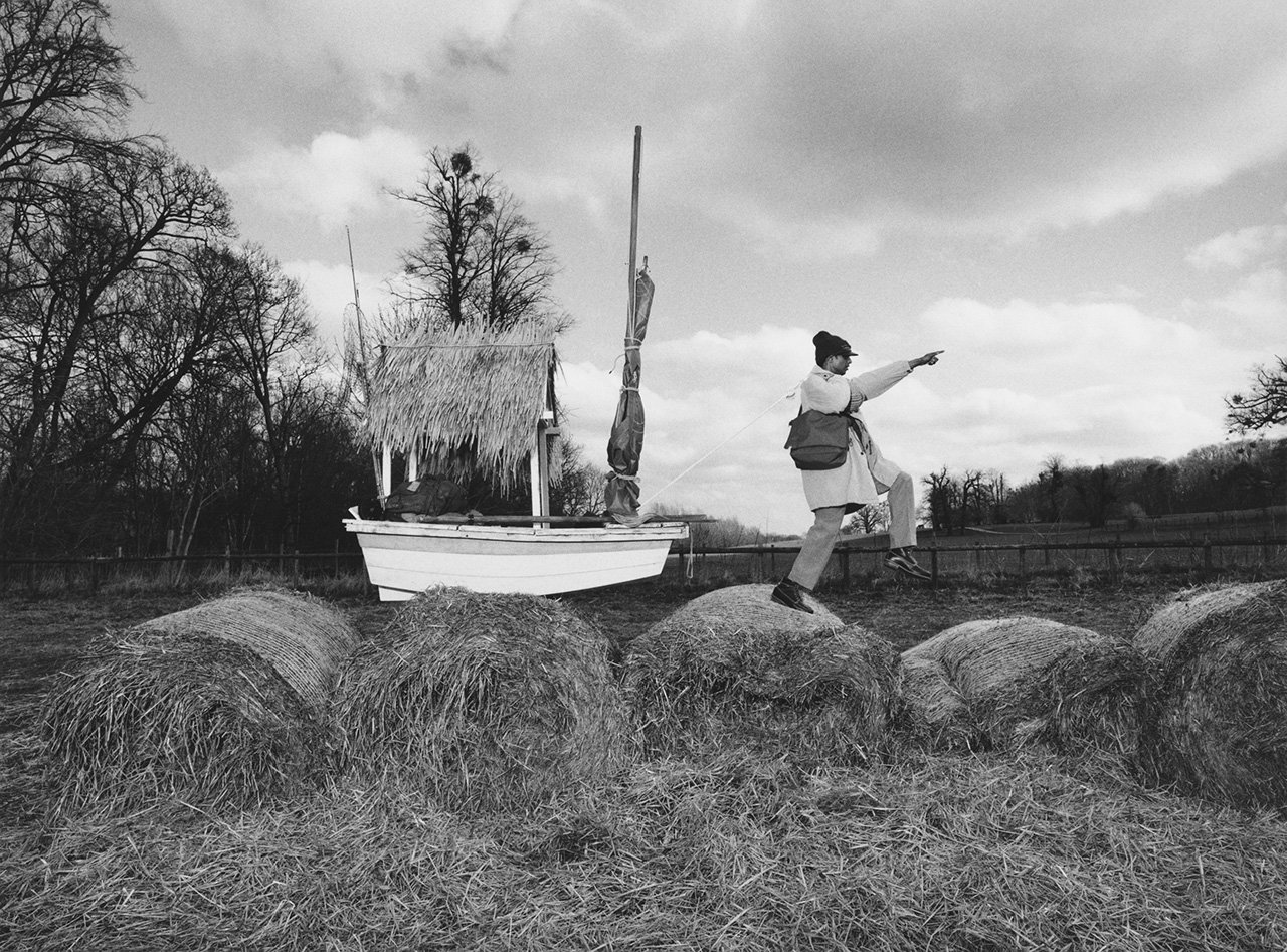
"Seas The Day" Published in Subsequence vol.5(2022)
There were a number of references for this one. The most prominent one I can remember is a man called Sven Yrvind, an eccentric Swedish boat builder famous for sailing across oceans in tiny boats he designs and builds himself. I read a lot about him when writing the text that appears in the story. I wanted to try and write from the point of view of the character in the story, in a stream of consciousness sort of way, channeling somebody else. I also took cues from a short story by Rudyard Kipling called 'The First Sailor.'
Some of the key visuals were inspired by the work of Duane Michals - particularly his series of nine photographs 'Things Are Queer.' There's an obvious nod to that series in the final image in the story which depicts a boy holding a painting of himself in a tiny boat on stormy seas.
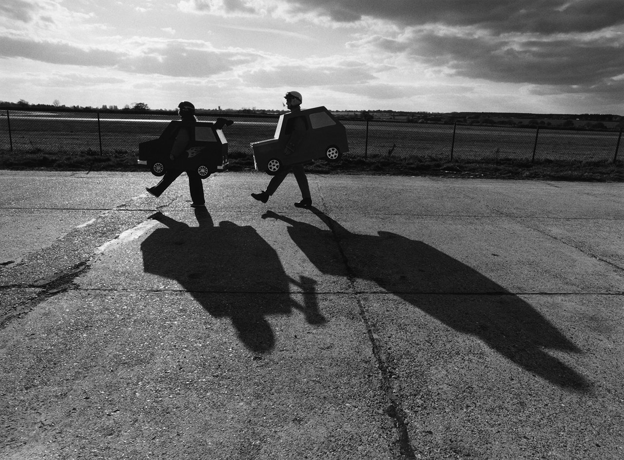
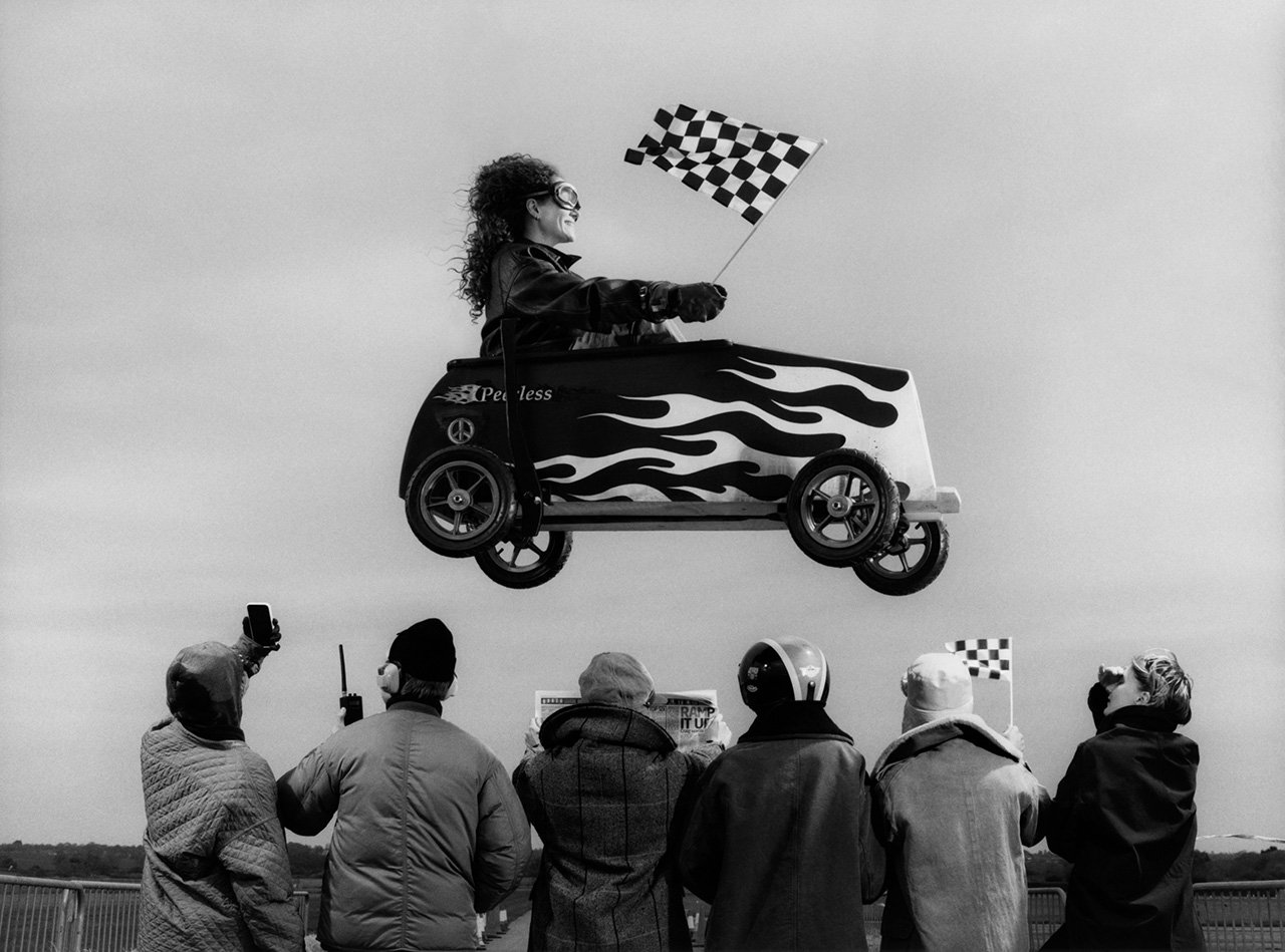
"Derby Rotten Scoundrels" Published in Subsequence vol.6(2023)
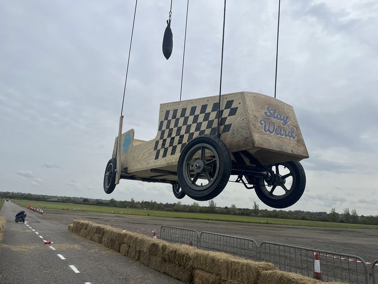
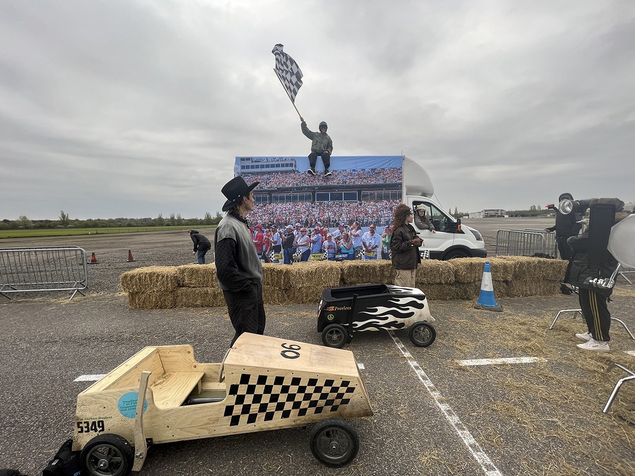
I believe our most ambitious concept to date. As well as the most difficult, although I am very proud of how the pictures turned out. This story is of course inspired by soapbox racing. I was pleased to work with a good friend and collaborator, Staci Lee, on the design of the cars and realization of the set.
There's an astounding level of detail in the images, from stickers on the cars Staci and I designed together, to things like the "no airbags" note on the dashboard. I especially like the "How's My Driving? Call 1-800 Visvim" on the back of the car, shown in a scene where Anders, one of our models, is being administered to be a medic after a crash. There's also a really fun reference to the Will Ferrel movie 'Talladega Nights'. One of Ferrell's catchphrases in the movie is "If you ain't first, you're last!." The winner's podium is a physical embodiment of this idea. This was also the first time we cast actors over models which is why the pictures feel more dynamic and emotional than previous issues.
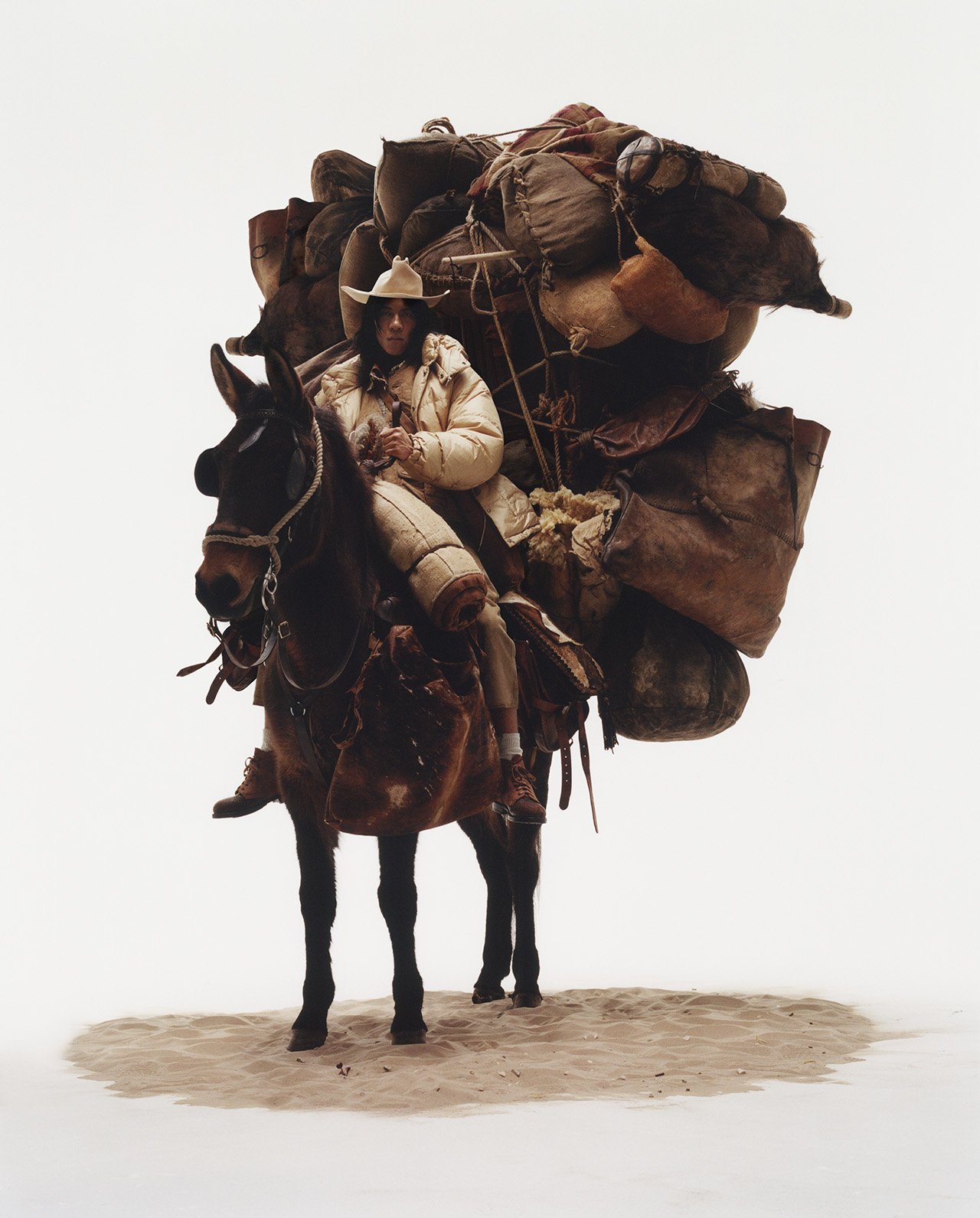
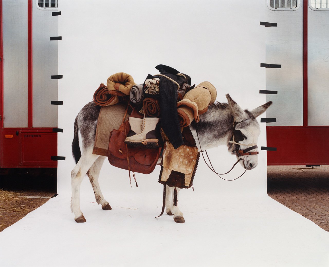
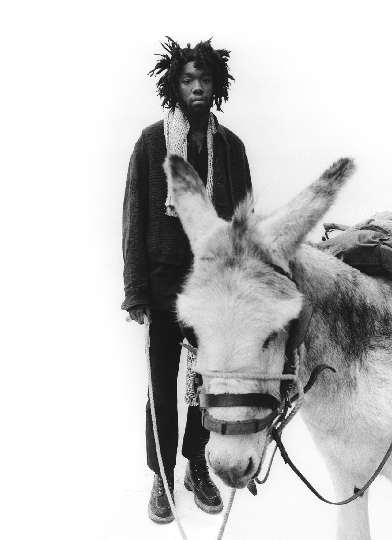
"Los Vaqueros" Published in Subsequence vol.7(2024)
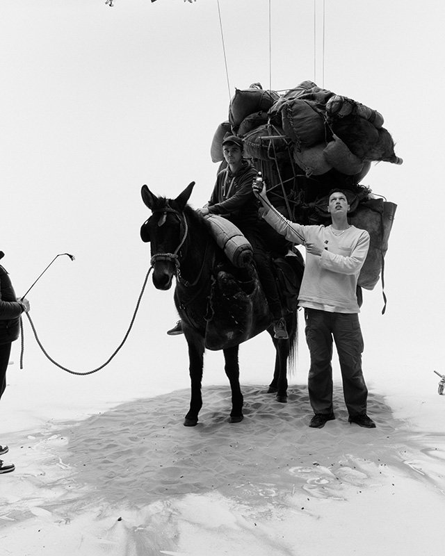
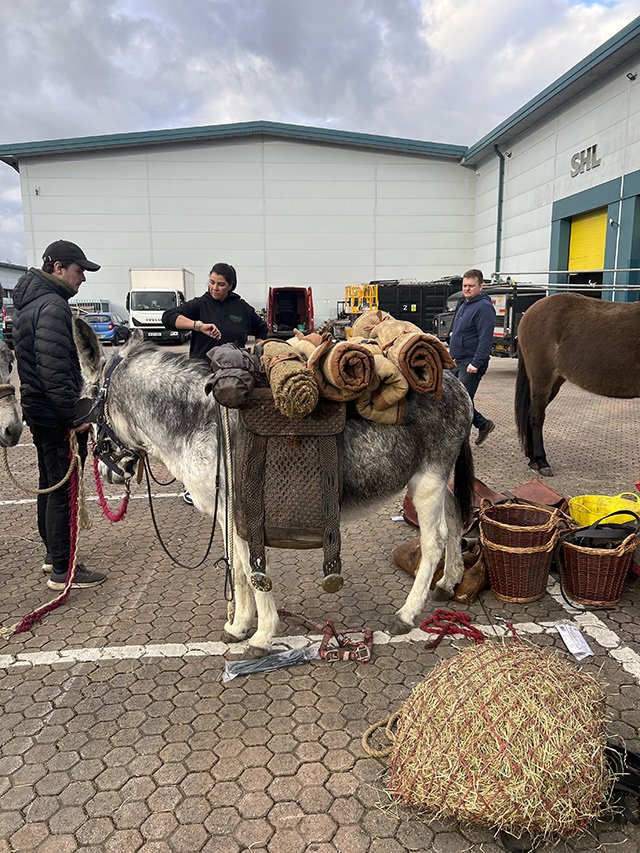
I am interested in exploring the idea of burdens within my work - I have a longterm personal project in development titled 'Loads'. Issue 3 piqued my interest in this theme and Issue 7 is very much a continuation of that - I imagine we will load up more things should our collaborations with the magazine continue!
I can't remember exactly what put me onto donkeys, but I had reference imagery from Inge Morath, Werner Bischof and Ferdinando Scianna - all from the school of Magnum of course. It's remarkable actually when you look at historical photos, how much of an important role donkeys have played in the development of human civilisation. There's also a strong undertone of Cormac McCarthy to this story - particularly his border trilogy. I must have read those novels four or five times. They paint such vivid imagery of the American South and Mexico that it's become deeply ingrained in my visual language. The title 'Los Vaqueros' is a tribute to that.
I did previously say Issue 6 was the most difficult but on this shoot I learnt the meaning of the phrase 'stubborn as a mule.'
Samuel Bradley
Photographer from England. Studied fine art and documentary photography at UCA Farnham. Has many clients including fashion brands and beauty manufacturers, where his work branches out from photography to include directing music videos and movies for high profile artists.
Stephen Mann
Stylist based out of England. Has become known for his unique point of view on fashion that is not bound by genres and remains timeless, gaining a reputation for creating work that brings out the individuality of brands. Also, a creative consultant who can offer branding and photo art direction for a variety of fashion related needs.
Photography work of photographer Samuel Bradley and stylist Stephen Mann are available for purchase on our official web store.
2024.10.8 Republished with revisions
2024.2.6 Original work published


